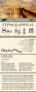
Scotch Modern - Victorian Typeface Popular in Books and Magazines9 Font | OTF | 4 Mb
Recontextualizing the 10-point type of a scientific report published in 1873, Nick Shinn has produced sleekly refined, micro-detailed vector drawings by eye, without the assistance of scans, thus presenting an ironic critique of the way in which mechanical imagery beguiles us with the trite veracity of simulacra. This beautiful genre of type, so popular in books, magazines and advertisements during the Victorian era and much of the 20th century, was derided by advocates of both the Arts & Crafts movement and 20th century modernists, and has never been properly adapted to hot metal, phototype, or digital media – until now. Now the full range of typographic expression is possible in this style. The OpenType fonts support Western and CE encodings, Cyrillic (with Bulgarian alternates) and Polytonic Greek. There are many special features, including small caps, unicase, italic swash capitals, ten sets of figures per font, and both slashed and nut (vertical) fractions. Together with Figgins Sans, comprises The ModernSuite of matched fonts.