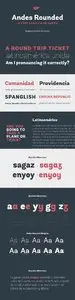
Tags
Language
Tags
June 2015
Su Mo Tu We Th Fr Sa
31 1 2 3 4 5 6
7 8 9 10 11 12 13
14 15 16 17 18 19 20
21 22 23 24 25 26 27
28 29 30 1 2 3 4
Attention❗ To save your time, in order to download anything on this site, you must be registered 👉 HERE. If you do not have a registration yet, it is better to do it right away. ✌

( • )( • ) ( ͡⚆ ͜ʖ ͡⚆ ) (‿ˠ‿)
SpicyMags.xyz

Massive Designer Bundle

Posted By: art_links
Massive Designer Bundle

Massive Designer Bundle
6 Font | WOFF | OTF | 4 MB

Springer font

Posted By: art_links
Springer font

Springer font
2 Font | TTF | OTF | 0.12 MB

A few years ago I created a logo which used the 'Spring' letters seen here. I created the letters especially for the design. Since then I have been selling premade logos and I ended up having a complete set of uppercase letters with the swirls. So, I've been working (slowly) on all of the other glyphs you can see in one of the pictures and have made this beautiful font for you.

Handmade font bundle

Posted By: art_links
Handmade font bundle

Handmade font bundle
10 Font | EPS | OTF | 3.83 MB

Andes Rounded Font Family

Posted By: art_links
Andes Rounded Font Family

Andes Rounded Font Family
10 Font | WOFF | OTF | 1.5 MB

Andes Rounded, designed by Daniel Hernandez, is a display typeface that has neo-humanist characteristics. Its different terminals, among other elements, give it a look of mixed typography. Andes is a typeface with 10 Upright weights, 10 Italics & Condensed versions, ranging from Ultra Light to Black, each of the same x-height. This typeface contains additional italic glyphs (a, y, z, g) that help to emphasise text or words. Andes is based on the design of Merced and both of them share several features. This type is well-suited for use in retail, magazines, logotypes, books, etc.

Furius Font Family

Posted By: art_links
Furius Font Family

Furius Font Family
4 Font | OTF | 2.7 Mb

Furius is a display typeface inspired by the split serif style of woodcut or chiseled letters found in roman inscriptions and later popularized by the western genre in the United States.

Graffiti Classic

Posted By: art_links
Graffiti Classic

Graffiti Classic
2 Font | OTF | 0.1 Mb

Graffiti Classic is a graffiti font that blends the improvisational urban quality of graffiti with the smoothness and regularity of a typeface.
Growing up in Brooklyn, graffiti appeared to me as an explosion of expression and color in a sea of concrete. Inspired, I became a graffiti artist and practiced in both notebooks and subway tunnels. While I moved on to somewhat more traditional art forms in future years, with Graffiti Classic I pay homage to my artistic roots in a calligraphy marker/tag font.

Vectors - Vintage Ornamental Frames 12

Posted By: posterb
Vectors - Vintage Ornamental Frames 12

Vectors - Vintage Ornamental Frames 12
3 AI | +TIFF Preview | 56 MB

Vectors - Dancing People Set 5

Posted By: posterb
Vectors - Dancing People Set 5

Vectors - Dancing People Set 5
3 AI+TIFF | 54.82 Mb

Green Kitchen - Creative Lettering

Posted By: art_links
Green Kitchen - Creative Lettering

Green Kitchen - Creative Lettering
26 JPG | 26 PNG | 22 Ai | 11 EPS | 2 TTF | 2 OTF

Brunette

Posted By: art_links
Brunette

Brunette
1 Font | WOFF | OTF | 4 MB

The Brunette font was created with the sole purpose to serve companies that want to express character, emotion and personal touch through their logotypes (think Bakeries, Juice Bars, Cafes, Jewelry stores, etc.) The font was made entirely from scratch (handwritten letters on paper), which were then vectorized and tweaked to gain consistency. The charm of Brunette is in its irregularity and resemblance to a real handwriting. The font is perfect for businesses that want to convey a casual and organic image and make their products more human and approachable.

Torrent

Posted By: art_links
Torrent

Torrent
5 Font | WOFF | OTF | 0.3 MB

The Torrent family is a multi-purpose typeface with large wedge-formed serifs. Its letters have large x-height and wide-open counterforms. Some joins have been opened up, too – between the straights and the diagonals of ‘K’ and ‘k,’ as well as the vertical center of the ‘R,’ for instance. Torrent’s letterforms have a higher stroke-contrast model, one that is typical for serif typefaces that are intended for use in lengthy passages of text. Indeed, Torrent is a highly readable text face and will look clear even when used in less-than-optimal printing situations (cheaper paper and ink, high-speed presses, etc.). In smaller sizes, Torrent’s wedge-shaped serifs won’t suffer any loss of detail. In fact, wedges of this sort are a hallmark of contemporary serif type design. Torrent is an excellent serif choice for use in book design or editorial design work, as well as in magazines, packaging, and publication design applications.

Stadt

Posted By: art_links
Stadt

Stadt
1 Font | WOFF | OTF | 75 KB

Stadt seamlessly combines typographic aesthetics from the 1950’s with a contemporary twist. This workhorse is meant to be set tightly, but looks equally smart with some extra space as well. We loaded Stadt with alternate characters and ligatures along with wide language support. Every glyph is immaculately drawn, spaced and kerned. With a full house of over 400 characters, Stadt brought me back to my early days of font-making. When I had an idea, I'd run with it, burning through the work straight for a week or two. Stadt came to me at time during which a project was put on hold so I concentrated on creating the bones of this typeface from morning to night. A month later, it is now available for you to use.

Vectors - Car Service Set

Posted By: posterb
Vectors - Car Service Set

Vectors - Car Service Set
4 AI+TIFF | 88.47 Mb

Escritura

Posted By: art_links
Escritura

Escritura
20 Font | WOFF | OTF | 5.8 MB

The handwriting typeface Escritura was created for editorial purposes and the letter forms are influenced by chancery handwriting from the Italian Renaissance. The asymmetrical shapes of the undulating serifs cause the characters to have a large aperture. Originally designed for display sizes, the typeface also comes in a text version for small sizes. With taller vertical proportions, the text version has slightly longer serifs and increased white space between the characters to optimize legibility in small sizes. Ascenders and descenders and serifs are shorter in the display version, which has more economical letter spacing resulting in a visually compact text image. The stress in the letter strokes create changing widths according to their direction, improving the calligraphic rhythm in the characters. The oblique crossbar as well as other typographic details lend the typeface that typical Renaissance atmosphere.

Vectors - Abstract Business Logotypes 8

Posted By: posterb
Vectors - Abstract Business Logotypes 8

Vectors - Abstract Business Logotypes 8
3 AI | +TIFF Preview | 61 MB