

Bootstrap: Build Interactive and Responsive Web Apps

Bootstrap: Build Interactive and Responsive Web Apps
Released 5/2025
MP4 | Video: h264, 1280x720 | Audio: AAC, 44.1 KHz, 2 Ch
Language: English | Duration: 1h 6m | Size: 234 MB
Released 5/2025
MP4 | Video: h264, 1280x720 | Audio: AAC, 44.1 KHz, 2 Ch
Language: English | Duration: 1h 6m | Size: 234 MB
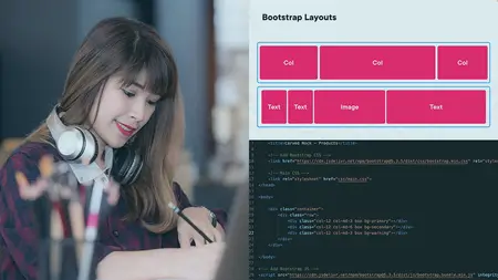
This course will teach you how to fully use and customize Bootstrap grids for complex and responsive page layouts. It will also show you how to easily stylize your pages and add interactivity with modals and carousels.
Building responsive web apps isn’t just about adding rows and columns—it’s about creating seamless, interactive experiences. In this course, Bootstrap: Build Interactive and Responsive Web Apps, you’ll learn to master Bootstrap’s grid system, customize layouts, combine rows and columns, and optimize designs for any screen size. First, you’ll explore Bootstrap’s typography, utilities, and styling tools, effortlessly adjusting text, colors, spacing, and more. Then, you’ll discover JavaScript-powered components like carousels, modals, and dropdowns to create dynamic, user-friendly experiences. Finally, you’ll learn how to apply these skills to a real-world product listing page, ensuring you can build professional-grade, interactive web apps that work beautifully on any device. When you’re finished with this course, you’ll have the skills and knowledge of Bootstrap needed to build more interactive apps.